
Confessions of a Former Design Magazine Editor
For the “design press,” a slice of the media universe sometimes deserving of air-quotes, the project piece is a staple. Because it both epitomizes and answers the eternal question—What’s New?—it’s the foundation of many magazines, websites and blogs. And for a good reason. Readers love them. There’s always a new building, museum, restaurant, workspace, library, light, car, sofa, task chair…a new something, and under the ideal conditions they all come attached with images. (Sometimes free ones, provided by the architects and designers themselves!) Those, preferably, sexy images are, in fact, often the project piece’s raison d’etre.
Some publications are essentially project books; others are a mix. But both approaches often put the editors involved in the position of being something closer to curators, rather than journalists (whatever that might mean in an era of Fake News). I was an editor for about a decade and a half and, after some trial and error (mostly error, on my part, many of my colleagues were better at “wrangling” than I was), I eventually learned the following ground rules, both spoken and unspoken:
- Ugly buildings always photograph better at night.
Here’s a tip: if a media kit’s featured image is a nighttime shot, beware, they may be dressing up a turd.
- Most project pieces are inherently puff pieces.
Unless you’re profiling a famous architect who has fallen out of critical favor, who we’ve all-sort-of-informally-agreed-isn’t-so-good anymore (see “Daniel Libeskind”), a negative project piece does something subversive and even rude: it calls into question the taste of the assigning editors. A no-no.
- On those rare occasions when a project piece isn’t a puff job, the designers involved feel betrayed.
And in a sense, they’re right, since the rules of the “game” have been changed, retroactively.
- What looks “good on the page” may have very little, or even no connection, to the functional use of the building.
It may, in fact, be aggressively at odds with it.
- Upon opening, every new building tends to be “good,” “great,” “innovative,” or at least “interesting.”
Otherwise, you might logically ask, why are they showing it to us?
- The never-ending quest for “The New” often erases from consideration the ultimate test for architecture:
Time.
- Putting people in the photos for “scale” is the preferred style now.
It conveys a humanism (however pseudo).
- If you’re commissioned to do a project piece and insist on taking a critical stance, you have to be A) a lot better than your gushing colleagues, B) funny (because nobody likes a scold), or C) independently wealthy.
- Some great buildings don’t photograph well.
Many more good, functional buildings don’t photograph well either. And those, especially, do not receive a whole lot of attention.
- Editors prefer visually-idiosyncratic-but-dysfunctional buildings over plain-but-functional-and even-beloved ones.
This is what I call “the tyranny of the page.” Or the visual equivalent of that old tabloid axiom: “If it bleeds, it leads.”
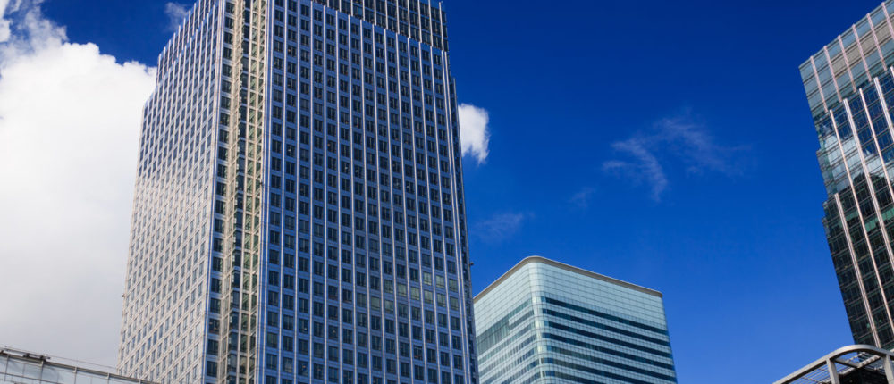
Featured image: via public domain pictures.