
Mother Nature Knows Best
I became a licensed architect at age 50, a couple of generations older than most of my classmates. This may have skewed my view of the profession. My younger peers entered the design world happy in the fledging knowledge they gained in school. I’d been around long enough to know how little we all knew.
Design is an act of discovery. Since childhood, books have been my research tool of choice. Now, at 91, I can report three pearls of wisdom gained from a near-century of bibliophilic study, experimentation, and professional practice.
1: Books speak volumes, but it’s the few lines that float into our heads that change us.
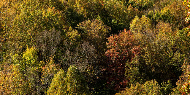
Route 17, upstate New York, 2014. I was a passenger in a car speeding along the Southern Tier Expressway. I sat, mesmerized by miles of gorgeous forests on my way to Ithaca for a family graduation, and thought, Why does color so bedevil interior and architectural designers? With all the hues available in nature, why is the built environment chronically painted beige? Yes, I know, inspiring coloration occasionally pops up. I see breakout palettes published from time to time in the design press. Nevertheless, the continuing reign of modernism’s “less is more” design philosophy keeps many bold color schemes from making it out of the studio.
Or maybe the problem isn’t less is more. Maybe the problem is that more is confusing. You can count on two hands the stable tints available as house paint in colonial America. Today, there are thousands. With the plethora of colors contemporary designers have to choose from, perhaps the profession is overwhelmed, if not stymied, by enigmatic color theories.
Whatever the cause, that many design professionals should limit themselves to greige is a shame. Heading northwest on Route 17, I wondered what could be done about that. Rounding a bend, the words of a favorite author came to mind: “Sometimes all you need to do is look out the window. Take a cue from nature.” A year later, I published The Nature of Color in Interior Design.
I first learned about color through the artist’s color wheel (Figure 1). The 12-point diagram is standard issue in art school. The wheel indicates three primary colors (red, yellow, blue) that combine to create three secondaries (orange, green, and violet); six tertiary colors can be made by combining a primary color with a secondary.

The artist’s color wheel is a refinement of the world’s first color wheel, an eight-spoke invention by Sir Isaac Newton. While studying prisms, he noticed white light split into a spectrum. Newton thought the colors were correlated to a musical scale and spent years trying to decipher its mathematics. He failed, but no matter. His wheel spurred the development of numerous other wheels and an enormous amount of color theory. Since then, a vast body of work has guided artists in selecting colors for everything from websites to paintings to apparel to buildings and interiors.
Color models are usually divided into categories called additive and subtractive (Figure 2). Newton’s wheel is additive because it’s based on the projected light of the sun. Add the wavelength from one beam of light to other wavelengths, and new colors arise. White results when you combine red, green, and blue wavelengths in equal amounts. The artist’s color wheel is based on reflected light. It is subtractive because inks and pigments absorb some wavelengths and reflect others to create new colors. Mix all subtractive primaries and you get black.
Lighting designers and those working from computer screens work with additive color models, and there are many to choose from, each with its own wheel. There are several varieties of subtractive color models as well. Architects and interior designers are expected to be fluent in them all, a complication made more complex when translating colors between models. What may look good in a computer screen rendering might appear terrible as wall paint or a custom-printed carpet pattern.

Whether additive or subtractive, a range of harmonious color combinations can be created through various algorithms. An analogous color scheme derives from adjacent colors on a color wheel. A complementary approach uses colors opposite each other. There are also split complements made by combining a primary with two analogous colors. Double split schemes use two pairs of complementary colors. Triads are based on three colors evenly spaced around a color wheel. A square scheme uses four colors.
Intuitive? No. Easy to comprehend? Heck, no. All of this is bewildering and intimidating, even when artfully explained. In 2018, I attended “Saturated: The Allure and Science of Color.” Held at the Cooper-Hewitt, in New York City, the show explored the “elusive, complex phenomenon of color perception and how it has captivated artists, designers, scientists, and sages.”
The exhibit displayed almost 200 items from antiquity to the present, each representing “how designers apply the theories of the world’s greatest color thinkers to bring order and excitement to the visual world.” There were also numerous rare books, more than three dozen from the Smithsonian Libraries.
These writings represent the long and ongoing debate about color design. That selecting and organizing hues is hard is evidenced by the sheer number of spheres, cones, grids, wheels, and other gizmos trying to make sense of it all. The mashup is understandable, given the odd mix of designers, naturalists, painters, mathematicians, and chemists who wrote the texts.
Among the readings were treatises from the Enlightenment, such as the 1704 Opticks, in which Newton described his music-color theory. There was also a book by Johan Wolfgang von Goethe, who famously called architecture “frozen music.” In 1810, Goethe wrote Theory of Colours, which dove deeper into Newton’s rainbow. Fascinating, too, was a surviving volume of Jacob Christophe Le Blon’s 1725 Coloritto, the first book to show how mixing primary colors produces secondary colors. Le Blon effectively laid the foundation for color printing.
And then there was architect Johannes Itten’s 1921 12-color diagram used by Bauhaus students. Itten took Philipp Otto Runge’s 1810 color sphere and flattened it into a star. Recalling Newton, Itten aligned 12 points to a chromatic musical scale. Although again failing to find a harmonic connection, his wheel had the advantage of simplicity over other theoretical constructs. Contemporary to Itten was the American painter Albert Munsell, who developed a nonsymmetrical system from spinning color disks.
Exhibited, too, was A Collection of Distinctive Hand-Block Printed linens and Cretonnes, published in 1900 by J.H. Thorp & Co. I have a yard of Thorp’s Emperor’s Garden, a 16-screen blocked fabric left over from an old residential interior project of mine. I consider it a handcrafted masterpiece of color design. (Fun fact: In 2018, I offered my Thorp to the Cooper-Hewitt. Never heard back from them.) Also on display was the 1915 Standard Color Card of America of fabric swatches used to standardize U.S. flag colors.
Images of the show’s color plates, prints, ceramics, and other objects were curated by staff to match today’s multiple color spaces. Among additive color models were the cascading style sheets CSS3 and CSS4 (used on websites); hypertext markup language (HTML); hex (for the hexadecimal color system), and its brethren RGB (red-green-blue), HSL (hue-saturation-lightness), and HSV (hue-saturation-value). There was also CGA, created for the Color Graphics Adapter first used in IBM’s 1981 personal computer. Also indexed and cross-referenced were Crayola crayons.
I left the show thinking, So many color systems and so little clarity about which one to use. What’s a designer to do?
Clients feel our pain. A Wells Fargo property manager once told me she was confused by the profusion of colors available in paint company fan decks. I’d spent eight years consulting in renovating their banks and corporate centers. The client asked me if there was a simple way to choose colors for a palette from all those paint chips. I told her no; fan decks were organized by chromatic intensity, not harmony. Potentially more useful were paint company brochures showing color “families” or “collections.” But even those, I told her, should be used cautiously. A color template is a generalized scheme, not a palette tailored for a specific project. Ultimately, I told my client, creating a color palette is the wild west—an exploration into unknown territory with not much to guide you.
What I didn’t tell her was that compounding the problem of color choice are environmental dynamics. Hourly and seasonal changes in daylight and differences in artificial lighting change how colors appear.
For all the theories ever produced and the myriads of color wheels published, an easy-to-use and easy-to-understand means of crafting palettes remains elusive. The issue plagued me for the next year and a half. It eventually chased me up Route 17 before slamming into my consciousness at 65 miles an hour: “Sometimes, all you need to do is look out the window to figure out what colors flourish in your specific light. Take a cue from nature.”
The lines were from Donald Kaufman’s book, Color and Light. Kaufman is a New York City interior designer with his own paint company. His book presents colors in beautifully photographed projects, each adapted to the unique natural light specifics of its location. Kaufman begins by talking about the “path of light” as it changes throughout the day, and the “complex interactions between light, air, and surface.” He feels the “choice of particular hues is far less important than how they are combined into a delicate balance.” Kaufman writes: “Light is the essence of color.”
Over the next few weeks, I explored the light of day in mountain scenes, sunsets and sunrises, desert views, vistas where oceans and beaches meet, and worlds under the sea. I looked at morning shots, pictures taken at high noon, and evening. I’ve been a scuba diver for much of my adult life and have witnessed light in all kinds of underwater settings. Every image I studied was a masterwork in color design and carefully calibrated to lighting conditions. Why is it that Mother Nature never makes a poor color choice, I asked myself. What does her color wheel look like?
As it turns out, it looks like Figure 3, and it leads to another pearl.
2: Nature uses four primary colors: red, yellow, blue, and green, one more than most other color wheels. Although the human eye is trichromatic, Mother Nature plays by a different rule.

I am not the first to make this discovery. Aristotle thought long and hard about color in the fourth century BC before assigning hues to what he considered nature’s four elements of matter. In the 16th century AD, Leonardo da Vinci picked up where Aristotle left off, associating yellow with earth, green with water, blue with air, and red with fire. In 1892, German scientist Ewald Hering suggested a psychological-neurological basis for why we see three colors but interpret four. His opponent-process color theory suggests our brains perceive colors as opposites: red vs. green, blue vs. yellow (Figure 4).

Aristotle, da Vinci, and Hering may have inspired Frank Lloyd Wright’s adoption of nature’s colors. His Fallingwater color scheme, now owned by PPG Industries, includes Covered Wagon, “a serene color that is reminiscent of the dying rhododendrons in the fall.” There’s also Lion’s Mane, “sun-soaked yellow with a dandelion undertone,” and Mountain Forest, “a dark, subdued, mature green with a holly undertone.”
Further study revealed the final pearl. 3: Mother Nature’s palettes are complementary. All those analogous, triad, square, and compound schemes did not apply.
Three aha moments led to a color theory that, at last, made complete sense to me. With nature as my guide, I developed a series of palettes that are simple to visualize, easy to understand, and hard to forget. I’ll delve deeper into the particulars through more articles in the coming months. Until then, you can get a sense of my thesis by ditching your color wheels and hiking through a forest. Or, take a slow drive through a park with your windows down. Keep your eyes peeled, take deep breaths, and open your ears. Listen carefully for a voice in your head that whispers, Nature’s taste is impeccable. When it comes to choosing colors, Mother knows best.
All images by the author except Newton’s Color Wheel, Goethe’s Color Wheel, and Herring’s Color Wheel, which are courtesy of Wikimedia Commons.