
The Scourge of the Boxy Skyscraper
Problem: How shall we impart to this sterile pile, this crude, harsh, brutal agglomeration, this stark, staring exclamation of eternal strife, the graciousness of those higher forms of sensibility and culture that rest on the lower and fiercer passions? How shall we proclaim from the dizzy height of this strange, weird, modern housetop the peaceful evangel of sentiment, of beauty, the cult of a higher life?
When Louis Sullivan wrote his famous essay “The Tall Office Building Artistically Reconsidered” in 1896, he could not have foreseen the length of its shadow. For more than a century architects have debated its assertions, but they have generally agreed with Sullivan on the main point: Tall buildings must either gracefully diminish toward the top or have a cap to define the top edge as it meets the sky. He warned, prophetically, that anything looking like a box would be an aesthetic failure.
Boxy skyscrapers were briefly in vogue when Mies unveiled the slender Seagram Tower, but generally only bland corporate sweatshops and developer cash cows stayed with the obvious diagram for maximum floor space in a given FAR. Following the 1916 New York zoning law, most cities required setbacks in tall buildings to allow light to penetrate the canyons they often created. Cesar Pelli was the architect most intent on sculpting elegant, tapered towers throughout his career, and he designed several of the most lauded tall buildings of the past 50 years. Adrian Smith, the architect of several recent supertalls, retained Sullivan’s wise model for breaking up rectangular masses into finial-like spires. And as Rafael Viñoly (and readers of the New York Times) recently learned, failing to do so could result in a creaky, wind-bent residential tower—and, eventually, expensive lawsuits.
Were the architects playing beer pong late into the night while building the models? Did Rem Koolhaas try to patent a “Pruitt-Igoe in mid-explosion and get laughed out of China?
So it is fair to ask: Why are we seeing so many new skyscraper designs that resemble teetering stacks of skewed boxes? Were the architects playing beer pong late into the night while building the models? Did Rem Koolhaas try to patent a “Pruitt-Igoe in mid-explosion” concept and get laughed out of China?
Virtually all of OMA’s recent tower designs are clumsy groups of cantilevered glass boxes plopped on their sites with little concern for context or orientation. Zaha Hadid Architects tends to add a few curvy surfaces to their buildings to hide the boxy banalities, but it is hardly immune to the trend. But why would someone like Frank Gehry, the master of signature forms, succumb to these fickle winds of fashion?
Gehry’s pair of boxy Toronto skyscrapers will dominate the city’s skyline for decades, though Canadians have generally managed to avoid the crazy hodgepodge of tower construction that has ruined cities like New York, Philadelphia, and Los Angeles. In fact, it was Gehry who bucked the trends in the Big Apple to give the city 8 Spruce Street, a metal-clad tower nestled politely into the fabric of Lower Manhattan. It looks like it belongs in New York and seems to have pleased the tough critics there.

Not so the Toronto monsters. Described initially by BlogTO as “cheese graters staring longingly at each other,” they were once a ménage à trois and are now a matching pair, though still 2 million square feet in floor area. Controversy dogged the project during a decade of planning review. Hence the developer funding the project recently revived it as a downtown arts center and condominium complex with a visual arts college attached—a peace offering to be sure. Perhaps he also demanded that his Toronto-born architect hew to the accepted developer vocabulary and simplify his often-wrinkled skins. The PR info says that the towers will be clad in “energy saving” new materials but does not say what they are—a familiar ploy to deflect criticism of what looks like mirror glass. The most distinctive features of the pair are rotating boxes at the top third of each building, not tapered but roughly the same dimensions as the lower portions. Mercifully, the base of one building preserves the façade of an old, beloved landmark.
Large cantilevers are difficult enough to engineer when they sit atop midrise structures, but they become wind-catchers when placed 1,000 feet in the air. They are also visually obtrusive and unbalanced, contrary to the contention that defying gravity is always exciting to humans with two feet on the ground. Since we are more aware than ever of our body’s role in perception, it is ironic that architects today strive to unbalance their buildings and create top-heavy designs rather than tapering ones. Raymond Hood and Cesar Pelli are no doubt turning in their graves as I write this. And the trend is not limited to very tall buildings—many current designs of every height feature death-defying cantilevers. Engineers are earning their keep devising ways to hold them up.
When rotating a rectangular floor plate two or three times at various levels, elevator banks and structural grids must accommodate the awkward shifts and eccentric loads, not to mention plumbing and mechanical stacks. So the payoff should be big—a view of the ocean, perhaps. Nothing in Toronto is tall enough to impede views in any direction from the new towers, so rotating their tops does nothing to improve views (as the PR info contends). Placing a couple of gigantic boxes 70-plus stories in the air seems to be the only excuse for an enormously expensive conceit. Is this another instance of false advertising?
Alas, the trend in development is still to hire a starchitect whenever the going gets tough with city officials or art mavens. Like box-office blockbusters, it takes a star to open the picture.
Alas, the trend in development is still to hire a starchitect whenever the going gets tough with city officials or art mavens. Like box-office blockbusters, it takes a star to open the picture, and no sum is too large when it comes to getting the name you want. Usually the star gets to pick his or her script without much interference, not always the case in the building industry. Why does this system still prevail when there are so few acknowledged masters in our field? Gehry, at 92, has led the list for decades now, and his best work is behind him. And why should any builder assume that all architects are equally adept at designing skyscrapers?
Dozens of articles on green building have condemned the construction of towers over 50 stories, yet every city seems to require its complement of big and tall icons. How odd that they should morph into boxy, banal stacks of what Warhol envisioned as Brillo containers. Hubris still attracts capital, and developers have some of the biggest egos on earth. A few years ago there was a rumor that someone in Chicago had put together the funding to build Frank Lloyd Wright’s Mile-High Illinois tower. That might have been a worthy endeavor, as it is one of his most elegant designs, but it wasn’t for housing. There is no excuse for building high-rise condominium towers if a city ceases to require office space, the natural building type for such construction. New York’s failed needle towers have proved that only oligarchs from elsewhere will buy these useless symbols of excess.
It isn’t clear how long will we have to endure the bane of boxy, twisted-floor tall buildings. It will probably take a few leaky apartments and the resulting lawsuits to steer developers away from an idea that was bad from the start but swallowed because a few influencers had them in their portfolios. Let us hope only a few are built. The paucity of peer-reviewed research and sound ideas for any building type leaves the industry with few alternatives to the kind of preposterous shapes and forms that emerge unabated from a few name-brand architects. Unlike box-office idols, these men and women don’t age out of their star vehicles. We have to look at their work for decades.
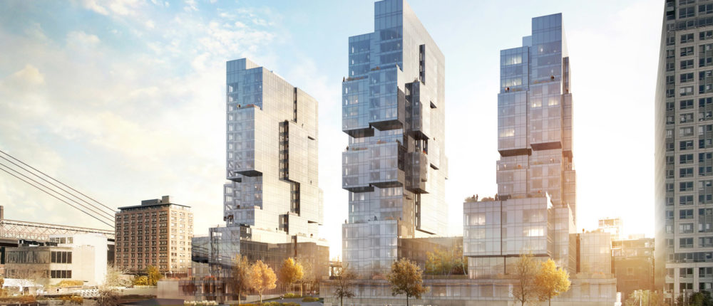
Featured image: Kent Avenue, Brooklyn, via ODA and Dezeen.