
David Adjaye’s 30 Shades of Gray
Sasha Nowicki’s Three Rules for First-Year Architecture Students:
- Never hide the entrance to your building.
- Never go down to go up, or vice versa.
- Dark colors make dark rooms; use them sparingly.
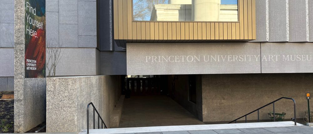
As I approached the new Princeton University Art Museum, I was confused. An inscription on the dark-gray concrete wall ahead of me indicated the building’s title, but there was no sign of a door or a clear way in. The walls—huge windowless slabs—hovered over a murky void; there was no sign of a stairway downward. Only when I was a few feet from the edge did a stair appear, so I took it. Though it was Christmas Eve and the museum would likely be full of visitors, I saw no one in the pit below. Because I was still in bright sunlight, my eyes were not yet dilated enough to see a doorway 30 yards ahead of me, the main entrance.
This unfortunate entry sequence is just one of the problems with the lavish new building designed by David Adjaye and Associates. As a visitor to the previous museum over many years, I knew that inside would be treasures and delights—indeed, one of the outstanding university collections in the world. Alas, as in the old museum, they would be located in a facility that contrasted bleakly with the wonderful architecture surrounding it: Whig and Clio halls, the University Chapel, and Nassau Hall. In the middle of one of America’s most beautiful campuses was an anomaly: a mute, lumbering structure that could well have been the university’s power plant.

Once inside, I found much to like about the architecture of the galleries and public spaces. The surprising journey downward into a dark lower level and back upward into a well-lit stairhall was worth the effort. A series of skylights bring illumination down three stories into a forecourt, where a large artwork prepares for the colorful stairhall ahead. Light draws the view upward to a wood ceiling with long skylights pointing toward the galleries on the second, or main, floor. A well-planned sequence guides visitors into generous public spaces, and a two-story court shows views of the main galleries parallel to the monumental stair that organizes the building’s center.
Though the parti is a pinwheel rather than an axial diagram, the strong cues in the lobby orient visitors toward the foursquare plan of the main collections above. This is a teaching museum, and visitors will need to know how to locate themselves for repeat visits. The public spaces feel open and inviting—I noticed a liveliness in the patrons throughout my visit.
Both natural and artificial light give drama to the spaces throughout the building, enhancing a fascinating journey from levels one to three, where the visitor will find a restaurant that opens to views of the campus. The decision to show 90% of the collections on the middle floor was sensible, and there are maps on many walls indicating where the art and artifacts are located. Since there are thousands of small objects, many galleries feature glass vitrines and shelves, all well-presented and labeled. A study library on the top floor allows students and faculty to find information on any of these art works.
As befits a major university known for its art history scholarship, the large collections in the major galleries are spectacular: Asia and Africa, Mesoamerica, Classical Civilizations, Photography, and American Art would each require a day or more for full enjoyment. I found the displays in the American Art section excellent and full of interesting contrasts (a contemporary piece referencing slavery might be adjacent to an antebellum object or painting, for instance). Here the walls were a light color, allowing all objects to be seen clearly. In the European galleries, dark–blue-gray walls had the opposite effect. I thought of the number of lumens required to light a large painting in such a setting and wondered why that color was chosen.
Indeed, the myriad surfaces and materials in the museum would challenge any lighting designer, as the predominant key is medium to dark gray. Structural walls of reinforced concrete mixed with large stone aggregate appear black on the interior, and either gray or light gray in sunlight. Most of the floors are a gray terrazzo flecked with black, with service areas of gray and black tile. Strangely, most of the ceilings are almost black, absorbing most of the reflected light from nearby windows or skylights. Where color is used—in furniture, wood walls, and sheetrock display panels—there is insufficient contrast to the dull gray of the predominant surfaces. Sadly, the main staircase is also covered in dark wood and concrete, with only flashes of intricate ironwork in the balustrade. The metalwork patterns are lovely and could have been exploited better. Of course, this building had a virtually unlimited budget, as donors’ names adorn every gallery, room, and feature—even the monumental staircase.

A contemporary architect like Adjaye looks for opportunities for surprising, interpenetrating spatial moves, and there are many in this building. Two odd rooms in the northeast and northwest corners seem wasted on minor artworks: a harpsichord and single painting in one, a pair of sculptures in the other. The warm lower-level seating area that also serves as a lecture hall has won deserved praise; lined by glass cases above, it is restful and beautifully lit. A gratuitous window on the east side showing a cylindrical tube works neither on the exterior nor interior. Many of the smoked-glass windows are either too large or too small to light adjoining spaces properly, and the gray interiors absorb too much natural light. The blunt metal window frames meet the concrete walls as if no thought were given to the details. Several rooms have giant, clumsy wood benches that proved uncomfortable when I sat on them. Otherwise, most amenities are elegantly designed and functional and are logically disposed throughout the building.
Had I designed this monumental building, Nowicki, my first-year critic at the University of Pennsylvania architecture school, would have failed me. The widow of Matthew Nowicki and a prominent early Modernist, she became a fixture in a school dominated by Louis Kahn. “Where you enter?” she would ask in her gruff Polish alto voice. And she would have chided me for using a palette of dark and middle grays throughout both the exterior and interiors. Not only knowledge of our visual system but the science of lighting design long ago showed the folly of such a strategy, particularly in public buildings. The question of why a world-renowned architect would make such mistakes is certainly one that his clients might ask, following reviews that have generally been lukewarm.
The initial decision to have the massive building hover uncomfortably above ground level created problems of descent and ascent and left most of the areas under the pavilions dark and unwelcoming. Perhaps this permitted the museum to meet the predominant cornice height of surrounding structures, but it was a poor tradeoff to be sure. As one walks around the building, nowhere is there an obvious indication of the interior organization, as both main entrances are under dark facades. Kahn, who had problems with entrances in several major museums such as the Kimball, organized his spaces logically according to the Beaux Arts model of marche, or spatial choreography. Adjaye doesn’t understand this when he quotes from the master.
The university has made several poor choices in recent campus expansion plans after decades of excellent stewardship of a landmark Collegiate Gothic campus. This museum isn’t a major misstep, as it will function well as a teaching venue and tourist attraction. It will blend into the morphology of the stone campus vernacular in coming decades, but won’t become a beloved neighbor to works by Venturi, Rauch and Scott Brown, Ralph Adams Cram, Cope and Stewardson, or Day and Klauder. The university simply checked another starchitect box to add to its collection. Maybe that was the point.
All photos by the author.